Haolingxiazai provides the latest software downloads for Transparent iOS X - Status Bar games.
Transparent iOS X - Status Bar
| App Name | Transparent iOS X - Status Bar |
|---|---|
| Genre | Personalization |
| Size | 11.3 MB |
| Latest Version | 1.4 |
| MOD Info | Premium Unlocked |
| Get it On |

|
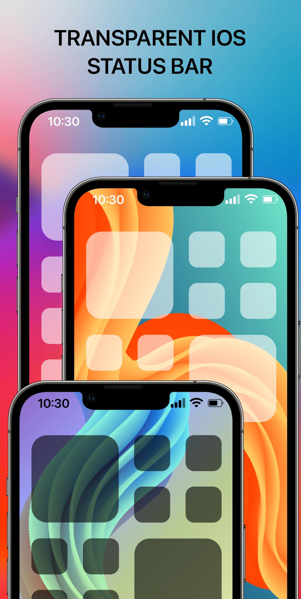
Add status bar & notch iOS Style with Transparent Status Bar, Color Status Bar
This app requires the accessibility service permission for:
• Show the custom status bar above the System's one.
• To start Accessibility service actions: By enabling the service, the application will support command for press, long press and swipe actions on Status Bar with following features:
- Back, Home, Recent actions.
- Popup notification, Quick settings.
- Popup Power dialogs.
- Take a Screenshot.
If you disable the Accessibility service, the features cannot work properly.
We do not collect or share any sensitive or personal information.
If you are looking for an iOS-style status bar, then this is the application you are searching for. The application supports both transparent status bar and colored status bar. Both of them have an iOS 16 style.
Customize status bar and notch styles iOS 16 with iCenter iOS 16: X - Status Bar. Make your phone unique with just you with status bar and X notch view iOS 16 style. Change your phone status bar & notch view with X Status Bar. Personalize your phone to stand out from the crowd, customize your status bar (notification bar), your notch with iOS style. Make your notch like iOS phone simple and very easy! Change your android smartphone status bar style to look like iOS 16 with X Status Bar.
FEATURE:
- Supports both transparent status bar and colored status bar.
- Fully customizable with a wide range of features: Solid Color style, Transparent Style color, notch style,...
- Custom your status bar and notch look like iOS 16 style in few step, no root needed, simple and easy to use, turn it on or off, make you phone look like iOS Style
- Show time, battery, connection status in your X Status Bar with X Notch
- Change the color of status bar according to your preferences or the app you are using
- If your phone has a Notch, those are wonderful your Notch Options with iOS styles.
- Hate your Notch? Simply Remove or Hide Notch with this app.
PERMISSION REQUIREMENT:
- ACCESSIBILITY PERMISSION : Set up and display the custom Status bar and notch, display and show more information time, battery, connection status. The application commits not to collect or share any user information about this accessibility right. Please open application and grant permission to enable iCenter iOS 16 X Status Bar.
Thank you!
What's New in the Latest Version 1.4
Last updated on Jul 9, 2024
Minor bug fixes and improvements. Install or update to the newest version to check it out!
Transparent iOS X - Status Bar refers to the visual effect of making the status bar on an iOS device running iOS 10 or later appear transparent or translucent, allowing the content beneath it to show through. This effect creates a more immersive and visually appealing experience, seamlessly blending the status bar with the underlying app or wallpaper. Achieving this transparency isn't a single toggle switch but rather a result of how developers design their apps and how Apple has structured the operating system's visual hierarchy.The status bar itself houses essential information like time, battery life, cellular signal strength, Wi-Fi connection, and other indicators. Traditionally, the status bar has a solid background color, often black or white, depending on the app and overall system theme. However, with the introduction of more dynamic and visually rich interfaces, Apple enabled developers to create a sense of depth and continuity by allowing the underlying content to bleed into the status bar area.
This transparency effect is primarily achieved through the use of blurring and vibrancy effects. The system takes the content directly beneath the status bar and applies a blur, creating a frosted glass effect. This blur allows the user to still perceive the underlying content while ensuring the status bar icons remain legible. Vibrancy, another key component, enhances the colors and contrast of the status bar icons, making them stand out against the blurred background. This combination of blur and vibrancy ensures both visual appeal and usability.
Developers can control the level of transparency and blur within their apps, allowing for a customized experience. For instance, an app displaying a vibrant image might opt for a stronger blur to prevent the status bar icons from being obscured. Conversely, an app with a simpler background might use a subtler blur, maintaining a cleaner aesthetic. This level of control empowers developers to tailor the status bar integration to best suit their app's design and functionality.
Apple's design guidelines encourage developers to consider the impact of the transparent status bar on the overall user experience. It's crucial to ensure sufficient contrast between the status bar icons and the underlying content, maintaining readability regardless of the background. This often involves dynamically adjusting the color of the status bar icons based on the underlying content's brightness. For example, if the background is predominantly light, the status bar icons might automatically switch to a darker color for better visibility. Conversely, a dark background might trigger lighter status bar icons.
The transparent status bar effect is not universally applicable across all apps and contexts. Certain system interfaces and functionalities, such as notifications and control center, might retain a more traditional solid background for clarity and consistency. The decision of whether to implement a transparent status bar ultimately rests with the app developer, balancing aesthetics with usability.
The perception of a truly "transparent" status bar is often an illusion. While the background appears to be see-through, the status bar itself still occupies a distinct layer within the user interface. This layer is simply styled to blend seamlessly with the content beneath it, creating the impression of transparency. This subtle distinction is important for understanding the technical implementation behind the effect.
The adoption of the transparent status bar design has become increasingly prevalent in iOS apps, contributing to a more modern and immersive user experience. This design choice reflects a broader trend towards minimizing visual distractions and creating a more cohesive interface. By blurring the lines between the status bar and the underlying content, developers can create a sense of depth and continuity, enhancing the overall visual appeal of their apps. This seamless integration of the status bar contributes to a more polished and professional look, aligning with Apple's emphasis on design and user experience.
The transparent status bar is not merely a cosmetic enhancement; it represents a shift in how developers approach interface design. It signifies a move towards more context-aware and dynamic interfaces that adapt to the content being displayed. This approach prioritizes visual harmony and user immersion, creating a more engaging and enjoyable experience. The transparent status bar is a subtle yet powerful example of how design choices can significantly impact the overall perception and usability of an app.
5/5 (69 votes)


